In manufacturing, keeping quality consistent isn’t a guessing game—it’s about closely tracking how things are running. That’s where Statistical Process Control (SPC) Charts come in. These charts act like real-time health monitors for production, showing when a process is steady or starting to drift. By plotting data over time, they help teams spot patterns, catch problems early, and avoid costly mistakes.
Whether you're building machines or managing services, SPC Charts give you a clear picture of performance. They make decisions easier, reduce waste, and keep quality on track. In today’s fast-paced industries, they’re more necessary than ever.
Statistical Process Control (SPC) Charts are more than just graphs—they're like visual warning systems for your operations. Built on actual data pulled from real-time activities on the shop floor or inside a service system, these charts track how a process performs over time. What makes them useful is their ability to show not just what's happening but whether what's happening is normal or something to worry about.
At the center of every SPC Chart is a line that marks the average performance of the process. Above and below that are the control limits—the range where natural ups and downs are expected. As long as your data stays inside those boundaries, it usually means the process is behaving as it should. But when the line crosses those limits, it’s a sign that something has gone off track and needs a closer look.
What truly sets these charts apart is how they help distinguish between two types of variation. Common cause variation is the everyday noise—minor changes that don't need much action. Special cause variation, on the other hand, points to something specific, like a broken machine or a misstep in handling. Understanding that difference saves time, reduces overreactions, and helps teams respond in the right way.
Statistical Process Control (SPC) Charts are not a one-size-fits-all tool. Different charts exist to suit different types of data and process needs. The Control Chart for Variables is one of the most common. It’s used when values can be measured on a continuous scale—like temperature, length, or pressure. For instance, a factory producing metal rods might track the diameter of each rod to ensure it stays within tolerance.

On the other hand, Control Charts for Attributes are used when data is counted rather than measured. These are ideal for scenarios like recording the number of defects in a batch of products. They give a simple overview of the frequency of problems without needing precise measurements.
More advanced tools like X-bar Charts and R Charts are used in situations where data is gathered in samples. The X-bar Chart displays the average of sample measurements, while the R Chart shows the range within those samples. These are especially useful in batch production environments where checking every unit isn't practical.
Beyond factories, industries like healthcare, software, logistics, and customer service use SPC Charts to track performance metrics, identify bottlenecks, and maintain consistent service quality. One of their biggest strengths is helping teams catch inefficiencies early—saving money, improving quality, and reinforcing continuous improvement strategies like Six Sigma.
The advantages of using Statistical Process Control (SPC) Charts are significant and practical. They simplify complex data, turning raw numbers into easy-to-read visuals. Instead of sifting through spreadsheets, teams can spot trends and anomalies at a glance. This clarity helps prevent issues from snowballing and allows for quicker responses.
Another major benefit is the shift toward proactive quality control. Rather than relying solely on end-of-line inspections, SPC Charts help identify issues early in the process. This reduces rework, scrap, and costs associated with late-stage fixes. It also builds trust in decision-making across the organization. When everyone from machine operators to senior managers works from the same data, alignment and confidence increase.
But these tools come with challenges. Cultural resistance is a common one — especially in organizations that rely on reactive problem-solving. Moving to a data-driven mindset takes effort, training, and time. Data accuracy is another concern. Faulty measurements lead to misleading charts, so teams must ensure consistency in data collection.
There’s also the need for ongoing updates. As machines wear or processes evolve, control limits must be recalculated to reflect new realities. Lastly, interpreting SPC Charts isn’t always straightforward. Without the right training, teams might misread normal variation as a problem — or miss a real issue entirely. That’s where expert guidance becomes essential.
As industries become more automated and data-driven, Statistical Process Control (SPC) Charts are evolving to meet new demands. Modern software allows teams to view and manage charts in real-time, often through integrated dashboards. Automation has replaced manual plotting, speeding up analysis and decision-making.

Artificial intelligence and predictive analytics are also entering the scene, helping forecast deviations before they happen. This proactive approach reduces downtime and boosts efficiency. The rise of IoT has further improved real-time monitoring, as sensors continuously feed data into control systems.
Despite the tech upgrades, human oversight remains critical. Machines can alert us to changes, but trained professionals are still needed to interpret the data and make sound decisions. As SPC tools spread into more industries, companies will need to invest in training. Skilled workers will be essential to fully harness the potential of these evolving tools.
Statistical Process Control (SPC) Charts offer a clear and reliable way to monitor processes and maintain consistent quality. They help businesses identify problems early, reduce waste, and improve overall performance. Whether in manufacturing, healthcare, or service industries, SPC Charts provide valuable insights that lead to better decision-making. As industries move toward data-driven operations, the importance of SPC Charts will only grow. They remain a practical and trusted tool for achieving quality control and fostering continuous process improvement in any organization.

Find out the key differences between SQL and Python to help you choose the best language for your data projects. Learn their strengths, use cases, and how they work together effectively
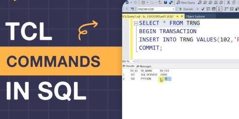
Understand how TCL Commands in SQL—COMMIT, ROLLBACK, and SAVEPOINT—offer full control over transactions and protect your data with reliable SQL transaction control

How COUNT and COUNTA in Excel work, what makes them different, and how to apply them effectively in your spreadsheets. A practical guide for clearer, smarter data handling

Building smart AI agents with LangChain enables developers to create intelligent agents that remember, reason, and act across multiple tools. Learn how the LangChain framework powers advanced prompt chaining for real-world AI automation

Stay updated with AV Bytes as it captures AI industry shifts and technological breakthroughs shaping the future. Explore how innovation, real-world impact, and human-centered AI are changing the world

Volkswagen introduces its AI-powered self-driving technology, taking full control of development and redefining autonomous vehicle technology for safer, smarter mobility

Learn how process industries can catch up in AI using clear steps focused on data, skills, pilot projects, and smart integration
How the SUMPRODUCT function in Excel can simplify your data calculations. This detailed guide explains its uses, structure, and practical benefits for smarter spreadsheet management

Confused between Data Science vs. Computer Science? Discover the real differences, skills required, and career opportunities in both fields with this comprehensive guide

Gemma Scope is Google’s groundbreaking microscope for peering into AI’s thought process, helping decode complex models with unprecedented transparency and insight for developers and researchers

Discover how DataRobot training empowers citizen data scientists with easy tools to boost data skills and workplace success

What Levenshtein Distance is and how it powers AI applications through string similarity, error correction, and fuzzy matching in natural language processing